Thank you for your patience while we retrieve your images.


81 of 113 photos
Thumbnails
Info
Categories & Keywords

Category:
Subcategory:
Subcategory Detail:
Keywords:*CVKC - Controlled Vocab, Advent, Art TITLES, Attitude, Bible, Church lingo, Commissioned Projects, DESIGN ELEMENTS, Foundational, God, Gothic, Italic, Luke, Luke 1:46 - 55, Magnificat - Joy in God, Main Color(s), New Testament, SUBMISSIONS, Spiritual Theme, Xtra keywords SORT, Zenfolio ONLY, biblical, blessed, blue, brown, calligraphy letter style, devotion, glory, green, heraldry, hopeful, illustration, informal capitals, inspiring, joy, landscape, laurel leaves, love, orange, paint medium, pardon, plants, praise, prayer, rocks, salvation, spiritual, strength, uplifting, water, watercolor
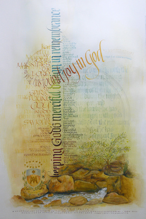
Magnificat, 2011 —Luke 1: 46 - 55

Magnificat, 2011 —Luke 1: 46 - 55

It was in July 2010, that Father Morrisey proposed working with the Magnificat text in anticipation of the Marists' 125th year of ministry in Minnesota. The recognition of their Jubilee Year would begin August, 2010, and will culminate with celebrations in August, 2011.

On December 1, 2010, we met and discussed some basic building blocks of this project, among which were: 1. the text would begin with the Greek words, "And Mary said" 2. The Msgr. Ronald Knox translation of the Magnificat, Luke 1:46-55 would be used 3. the size cover a vertical space of about 24"x38". 4. The Marist crest/coat of arms would be included 5. A Latin Magnificat chant line would be incorporated somewhere in the design 6. The due date would be early August 2011.

I designed some layouts and studied the text looking for a theme phrase or phrases for a focus. I had traditional sketches with illumination and the image of Mary with the Child Jesus. There were contemporary sketches incorporating rocks and some vertical and horizontal lettering. Subsequently, it was determined to use the contemporary layout. The next step was to refine and solidify the design. Each design element became a kind of puzzle part. As they were moved around, I observed each interacdtion with adjacent layers, colors values and shapes. Working with watercolor, pencil, pen, brush, watercolor paper, tissue paper and acetate, I ben to visualize a pleasing balance, harmony, proportion and contrast of the design elements.

A goal in this painting was to have different levels in which the viewer could participate.
From a distance, the viewer can observe the blocks of text and illustrative features and be drawn into the piece by the different layers. The most prominent are the bold vertical line, the emerging horizontal line, the rocks and water. Another layer is the main text stated on either side of the vertical line. The next layer is the main text written on either side of the vertical line — a foreground layer